Web Inclusivity: Considering WCAG Compliance in our applications.
When I started my degree in Design Computing in 2017, I never really learned or talked about software accessibility or inclusive design. I only focused on the aesthetic aspects of UX/UI design, the only thing in my mind that I thought could give me the most marks. Now working professionally for 2 years at TechLab, and constantly deploying applications to the broader audience, inclusive design has been in the forefront of my design process, specifically methods on bringing WCAG compliance to our applications. I would like to share some of the processes and tools that go towards making applications WCAG compliant.
What is WCAG?
WCAG (Web Content Accessibility Guidelines) are defined by W3C (World Wide Web Consortium), an international community that develops online standards. This set of guidelines are meant to enhance mobile and web functionality to be friendlier and give end-users extreme flexibility. Due to the dynamic nature of mobile and web technologies, WCAG guidelines are regularly updated to meet those new standards. WCAG 2.0 is used mostly for web accessibility – but the latest version, 2.1 provides support of accessibility on mobile devices.
Requirements for making a site WCAG-compliant
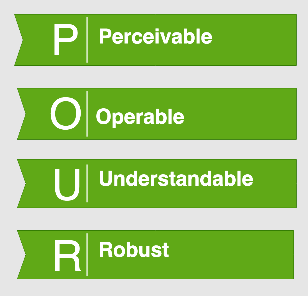
To ensure that your application meets the WCAG standard, it must follow the four POUR design principles:

- Perceivable: Information and user interface components (interactive links, text boxes, buttons, and so on) must be presented in a way that all users can understand. If the applications useful content is completely imperceptible to any of its users, it fails the perceivability test.
- Operable: User interface components and navigation must be operable.
- Understandable: Information and the operation of user interface must be understandable. If a user cannot grasp how a website works or what its information means, it fails the understandability test.
- Robust: Content must be robust enough that it can be interpreted reliably by a wide variety of user agents, for example, not only standard web browsers but also third-party assistive technologies such as screen readers.
How do I make applications WCAG-compliant?
WCAG fortunately breaks down the POUR design principles into several lower-level guidelines for specific topics and further dissects each guideline into a set of success criteria, which can act as a checklist for compliance.
The success criteria are also classified under three levels: A, AA, and AAA, with A providing the most basic level of accessibility and AAA the most comprehensive. In most cases, I only meet the demands of WCAG compliance to up to AA. Though it’s beyond the scope of this article to list the guidelines and criteria in full, I use these checklist guides to make sure I am following all WCAG requirements.
Tools for testing accessibility compliance
Accessibility tools for checking color contrast
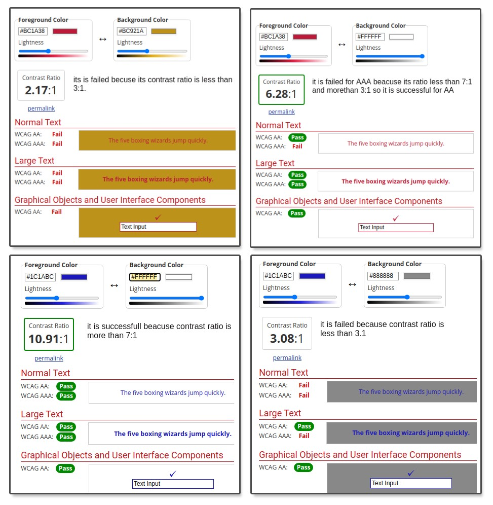
- https://webaim.org/resources/contrastchecker/ is the most basic tool in terms of checking color contrast. I use this tool the most as it influences me on the use of color, early in the design process, to check on things such as buttons, banners, images, etc.

Accessibility tools for checking the code
- WAVE Browser extension for Chrome and Firefox will check a range of features, including color contrast, the use of alt text, Accessible Rich Internet Applications (ARIA) labels, form features, Document Object Model (DOM) structure, missing titles, duplicate content and much more. The tool also provides tips on how to fix the found errors and references to accessibility guidelines too. We find it very useful for quickly checking heading hierarchy in the Outline view.
- AChecker is an online tool for testing live websites, which also provides results grouped by Guidelines.
- Pericles is an online screen reader tool. I use this to check the order in which text is read.
Accessibility tools for testing keyboard navigation
- Mozilla Firefox is a great tool for checking if the website can be used with a keyboard. To enable keyboard navigation, locate and enable the “Always use the cursor keys to navigate within pages” setting in your Settings or Preferences panel.
Designing for Dignity
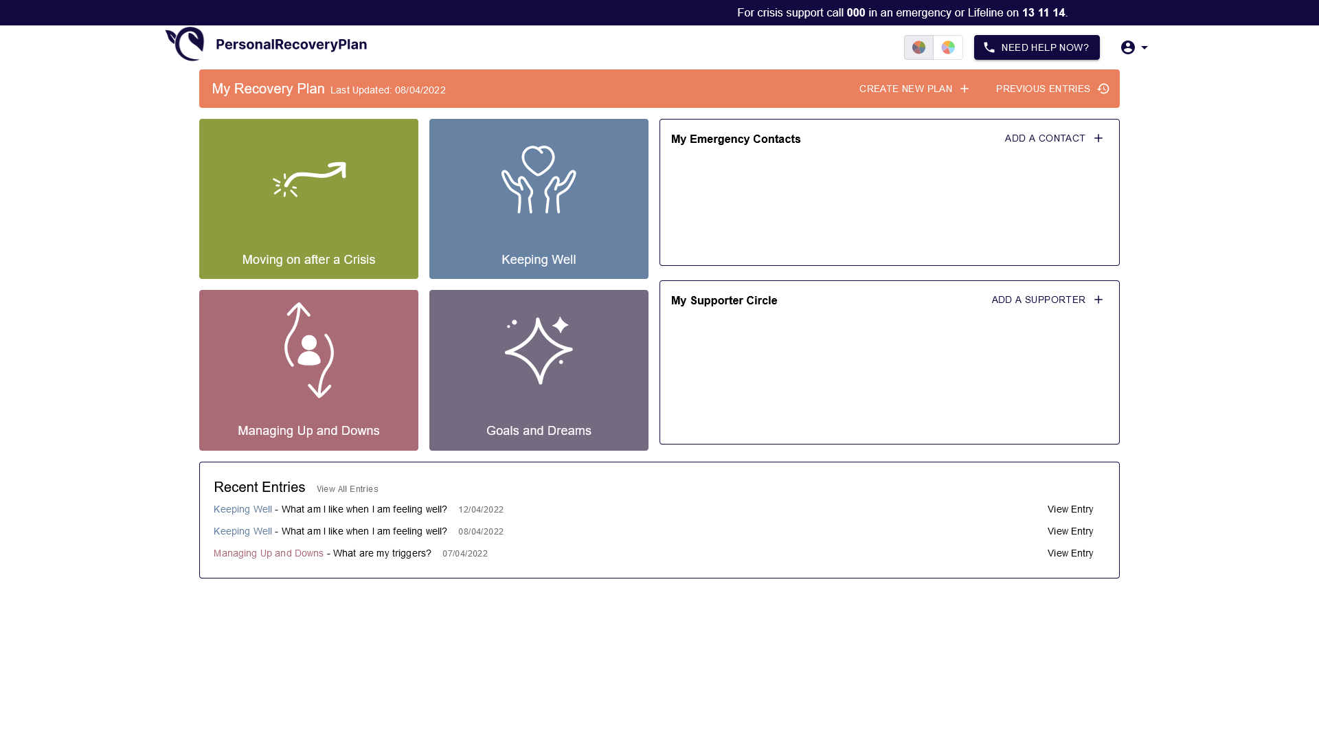
Designing for dignity is about ensuring people of all abilities can access an application in a way that is equitable for all. It is about designing a workflow with the expectation that people can access the application like everyone else, regardless of mental or physical disability. However, it is sometimes impossible to entirely gauge a user’s lived experiences. In terms of a recent TechLab project, PersonalRecoveryPlan, there are several factors that can contribute to an at-risk user to trigger a mental crisis. This means the application will have to take measures in supporting that user if that adversity strikes. These measures include designing coherent buttons and workflows for users to access external and internal resources that may assist their crisis.

Why does it matter?
Dignified access for all users allows them to access and navigate an application/website on the same basis as their colleagues and other users. To the point where they can do it independently. Taking these comprehensive measures represent the crucial ethos to build a better and more inclusive web. Presently this is most prevalent as 15% of the world’s population has some sort of disability and 1 in 8 people currently suffer from mental or neurological disorder (WHO).
The University of Sydney also has a large presence in improving access and inclusion for people with disabilities. This is arranged in the Disability Inclusion Access Plan which is reviewed and renewed every 6 years. The Disability Inclusion Access Plan is a strategy for changing practices which may result in the discrimination against people with disability. It identifies and removes barriers for people with disability to fully participate at the University, including its learning, teaching, physical, digital, living and communication environments. Digitally, the plan saw the roll-out of accessible communications technology across the University, including the installation of accessibility software across student computing spaces, and all University of Sydney web pages being progressively updated to meet WCAG standards.
As an innovative team and environment at Techlab, we don’t only pave the way in emerging technologies and processes, but we also sustain the values that The University of Sydney maintains in the space of inclusivity, dignity and accessibility in all our products.
